Friday 11 December 2015
9 Music Video Analysis
1. Some of the music videos I watched were either, funny, weird, cool, shocking or "controversial". I thought all of the videos I watched were great. It was mostly my first time watching the music videos, but i have listened to the songs before.
2. I considered "Closer" by Nine Inch Nails, and "Heart Shaped Box" by Nirvana works of art because both music videos are considered "controversial"; because in Heart Shaped Box, there's a little girl that wears a Ku Klux Klan outfit, an old man who crucifies himself and unborn fetuses hanging from tree branches. In the Closer music video, there's a monkey on a cross, there are multiple frames of a naked woman, Reznor, (Nine Inch Nails frontman) wearing an S&M mask and leather gloves as he hangs from shackles, and a pig's head spinning on some kind of machine. I classify this as art because art doesn't have a definition. Art has messages and is supposed to make you feel emotions. It's also supposed to make you think about what's going on. Art can be anything.
3. Most of the music videos through the decades that I watched had pretty much the same lighting and picture. I think that's because most of the videos were filmed in the 90's and the 2000's, when the technology wasn't that good.
4. The Arcade Fire video compares to the earlier decades because because it's a modern video but it has some of the quality of the videos from the decades. For example, the lighting was dimmed really dark when the boy was running. That usually shows age in a video, which can also be deceiving. It also compares to the other videos because they band, Arcade Fire has a unique musical style and sound, makes them sound like an Indie Rock group from the decades.
I have included the music videos that i mentioned below:
Nirvana Heart Shaped Box 1993
Nine Inch Nails Closer
Arcade Fire We Used To Wait
Monday 15 June 2015
Kinetic Typography Video Write-Up
This typography video is called "Ogres are like Onions". The audio is from the first Shrek movie. It is taken from the scene where Shrek and Donkey are going through the sunflower fields to see Lord Farquaad, and Shrek is telling Donkey about how ogres have layers. I made this video in a program called After Effects and edited the audio from Garage Band.
The thing I like about the final product is that I some-what figured out how the program worked. On reflection, I would probably change the program to one that would be easier to use, so that way I could finish it. My design choices were simple. I tried to find the Shrek fonts online, but they had things wrong with them, so I found a font in After Effects instead that looked like the font from the fairytale book from the beginning of the movie. I'm not completely sure what I did to get the final product to be honest, I just did it. But to get what I have, I asked my friend Hannah for alot of help and I also watched alot of tutorials on YouTube for what to do.
The challenges that I had with this video would be trying to understand the way to animate the words and import/export the audio. The solutions that were successful were when i figured out how to get the blue background and figuring out how to make a few words move. (I needed help to get the other ones to move.)
The Video is above. (I apologize for the in completion.)
Digital Self Portrait Painting

For CyberARTS, I had to design a self portrait of myself in photoshop using one of the at styles we covered in class. I chose Colour Field.
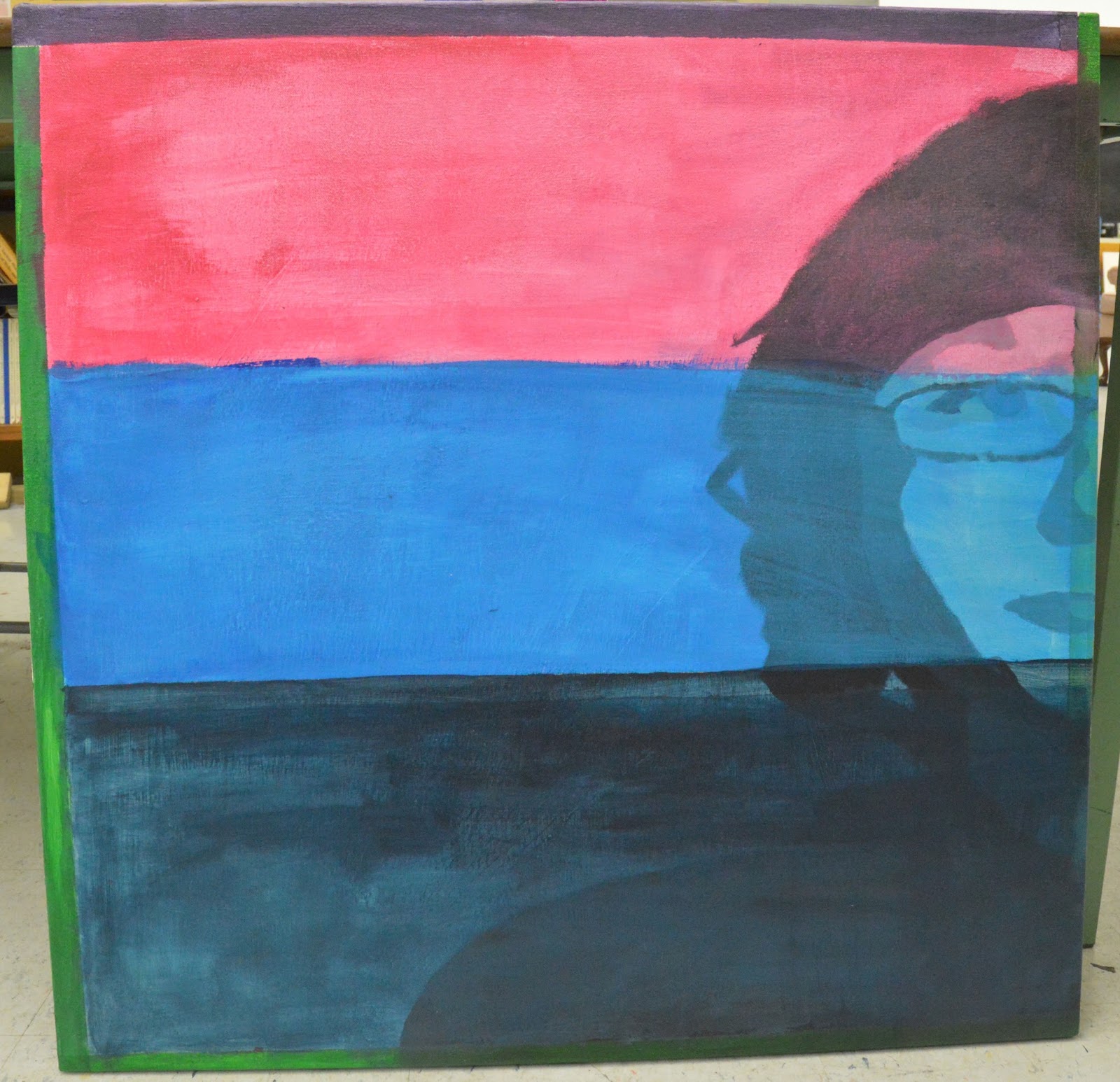
And this is the recreated version on canvas. The composition is exactly the same because before I painted, I opened the photoshop document and traced it onto the canvas.
Comparing the two, I think the canvas looks almost the same. The composition is the same; but the difference wold be the colours. the shades of the pink, light blue, dark blue and green are just a bit different because it was hard to mix the exact colours. Although, I think the dark blue is pretty close. At the beginning of the painting process, I had to paint it in black and white. The only catch was that we weren't allowed to use store-bought black paint. We had to mix our own. Mixing my own black was difficult, because i had to mix the right amount of dark blue and add the right amount of yellow to darken it. That was one of the hardest parts of the assignment.
The other hardest part was putting the tape down straightly to paint the three stripes. Putting the tape down was hard, but I got it.
I had a slight problem with the actual image in photoshop, where the image got distorted, and since i traced that image onto the canvas, the painting looks a bit distorted.
Friday 12 June 2015
Culminating Poster
In CyberARTS, each of us had to make a poster for an event for our culminating.


My Creation Process: First, I started researching cool ways to make a poster online. After that, I decided to goof around and see what I could do. When I thought about the assignment, the poster was for a digital arts showcase. When I thought "digital", I automatically thought "cameras and computers". My teacher said that we could use pictures from the internet, but we had to edit them, so they didn't look like the original. So after thinking, I took a picture of a camera from Google and put it into Photoshop. After that, I looked through the Filter Gallery and saw the Style folder thing and saw the "Glowing Edges" effect. I clicked on that and the camera instantly went black and the white on the camera had a neon glow-like effect.
I was then finished with the camera and I opened a new project. After that, I started to work on the background of the poster. I chose blue because it has a soothing feeling to it and it looks good with black. The plain blue looked boring, so i looked for a cool effect to use. I went to the top bar and clicked on "Filters". I saw a "Tile" effect and I clicked on it. It made my background look like tiles :). I liked the tile effect, but I wanted it to look more digital in a way; so I went back to Filters and clicked "Liquify". I then started to liquify the tiles and making the white lines look like an I.V.
The font is what i worked on after. I used the Poplar Std font. It makes the name of the event and the other important details stand out.
The computer I also got from Google. I used the "Eraser" filter to delete the "Apple" symbol. I then also put some "Noise" on the computer to give it that digital look.
The Gradient on top was the last thing I did. I clicked on the "Gradient" tool on the left side bar and selected the first one. I picked a dark blue and made the gradient. The blue then blended in with the background.
I feel that the images I chose work with the event and what it's about. They are both digital.
Saturday 9 May 2015
Typography Video Analysis
In CyberARTS, I had to find a Kinetic Typography video that displayed 3-4 principles of animation. I found and chose this one. This is Savior by Rise Against.
The colour choice for the font and background suit the lyrics and the heaviness of the song. Red, black and grey are dark and angry colours, which goes with the way the song sounds, and Tim Mcilrath's voice.
I think the font used works with the lyrics because it's a font that looks rough and the song used is quite rough, so I think it works.
The timing through out the whole video was great. Except for 0:16 where song got fast and the lyrics didn't keep up for a little bit.
Thursday 30 April 2015
Still Life Drawing

In CyberARTS, my class did a still life. We had a table with a bunny, a vase with flowers, a weird sculpture, a smaller sculpture, blocks and a male torso mannequin. I chose to draw the mannequin torso, weird sculpture and the smaller figure. The key of the assignment to make the drawing look as realistic as possible.
The hardest part for me was trying not to show any outlines while drawing because that is another key to make something look realistic.
I think it looks okay :)
Monday 16 February 2015
CyberARTS Surrealism Culminating Artist Statement

My culminating is about teen girls being sexualized by the media.
My intended message for this image was to tell all the teen girls that they don't need to listen to/watch the media to be beautiful or sexy. I used the Cosmo magazine because that is one of the most go-to magazines for fashion, make up and sex advice, especially for teens. I also used it as way of communicating a use of media to influence the sexulization of girls.
How I made this image: At the very beginning, I made some sketches of girls taking "Selfies" in the mirror because selfies are the #1 trend on social media at the moment. I also started researching how the media portrays women in magazines, music videos, images, advertizements and more. Once I was ready to take my 3 pictures, I went to the girl's bathroom at my school and took a few shots of the full-body mirror to get my first shot. For my second shot, I asked my friend Ivy to stand and hold an iPhone to make it look like she was taking a selfie. After that, I opened Photoshop and started working. I used 3 layers to to put the picture of Ivy and the magazine on the picture of the bathroom. I used the spot healing brush to remove stray hairs or other issues, and then I used the refine edge tool to make Ivy's edges and curves blend into the background. With the magazine layer, I placed that under the bathroom layer so that it'll show up behind the mirror and look like a reflection. To blur the magazine, I used the blur filter and adjusted how high or low I wanted it blurred. After that, I decided I was finished and saved it.
I learned alot while making this image. When i first started the project, I didn't quite know what I was doing and needed alot of help. But after finishing it, I now know how to use filters, layers, masks, image selection and alot more. I am very satisfied with the end result because I feel like I can communicate the message that is very important for every youth to hear.
Rick Mercer Report Photo Challenge
.jpg)
This is the original image that Rick Mercer want to change for the Photo Challenge.

For those who don't know who Rick Mercer is, he is a host for hist show, The Rick Mercer Report on CBC who makes fun of the Canadian politics. Every week he does a "Photo Challenge". That's when he puts a picture just like the one on the very top, and people send in pictures like the one I made. But the rule is that the image must be edited in Photoshop.
Here's the link to Rick's Website:
http://www.rickmercer.com/Photo-Challenge.aspx
Modern and Post-Modern Art Styles Prezi
In CyberARTS, our class had to pick a style of Modern or Post-Modern art and find 3 artists from that time period and research them; then put them into a Prezi.
Here is the link to my Prezi about Surrealists Salvador Dali, Rene Magritte and Victor Brauner:
https://prezi.com/vtzjswtgdg5l/surrealism/
Here is the link to my Prezi about Surrealists Salvador Dali, Rene Magritte and Victor Brauner:
https://prezi.com/vtzjswtgdg5l/surrealism/
Tuesday 20 January 2015
Digital Surrealism Prezi (Part 1)
In CyberARTS, everyone had to choose a surreal artist from a list and do some research about him/her. Then we had to put the research into a Prezi. (Presentation software)
I chose Max Ernst.
Here's the link to my Prezi:
https://prezi.com/9uuwjdjqnbpa/the-history-of-max-ernst/
Tuesday 13 January 2015
Mr Meli's Math Poster

This is the Math Poster that i designed on Adobe Illustrator for my old math teacher. He asked my CyberARTS class to design some math posters to hang in the Math Department classrooms.
The one I did describes how I think when I'm in math class.
Friday 9 January 2015
My Realistic Chess Piece Drawing

In Art, each member of our class had to choose a chess piece. I chose the Pawn because i thought it would be easier to draw :p. Anyway, I wanted to put in chess boards because i thought it matched the whole "Chess Piece theme". I added the TV because around the time when we started this assignment, I was obsessed with the music video that Bush came out with for "The Only Way Out", back in October. And in the video, Gavin Rossdale (The lead singer for Bush) was singing inside a TV. So that video gave me inspiration to add a TV in my drawing.
My drawing shows Rhythm and Pattern because the chess board wall and floor look like they never end and just keep on flowing while the checker board repeats itself.
PS: I apologize for not posting in a while. I've been doing alot of studying.
Here's the link to "The Only Way Out"
3:6:9 Video Written Response
In CyberARTS, we were put into groups and we had to pick one of our school departments (eg. Wood shop, Art etc.). My group and I chose Cosmetology. During CyberARTS, we went to the Cosmo room and we each took 3 pictures and 3 videos of the girls curling hair and doing makeup. After we got our shots, we opened up iMovie and put the shots and pieces of video together. I was in charge of the music, so I added the Elevator Music :D.
The strengths of the video, were that our group worked together and were each given a job to do. The weaknesses were that a member and I were confused about how many shots were allowed to take, each; and had to keep asking for help.
The music i chose impacted the emotion of the video because, the classroom we were in was really chill and layed-back. So I thought the elevator music used, suited the video.
The editing decisions we made suited the music because we chose comfortable fonts and colours. we also added blending, so 2 slides would blend into each other at time with the music.
The pace and transitions assisted to create mood and emotion because of the way the slides blend in to each other. I think it adds effect and adds a chilled mood.
I've always like working in a group. I've just always found it alot easier to finish a project or assignment with a few more people. I also think that working in a group, makes the assignment more fun. My experience with working with this group was a good experience. I had fun working with them and i loved making the video.
Here's the Video. Hope you like it :D
Subscribe to:
Posts (Atom)